Your Cart is Empty

How to Make D&D Maps
March 02, 2021 5 min read
Why is making D&D maps so hard?
I might be in the minority here, but I find designing maps to be one of the trickiest parts of adventure writing. Still, after ungracefully stumbling my way through drafting a lot of maps over the years for publication, I've learned a few ways to ease the process.
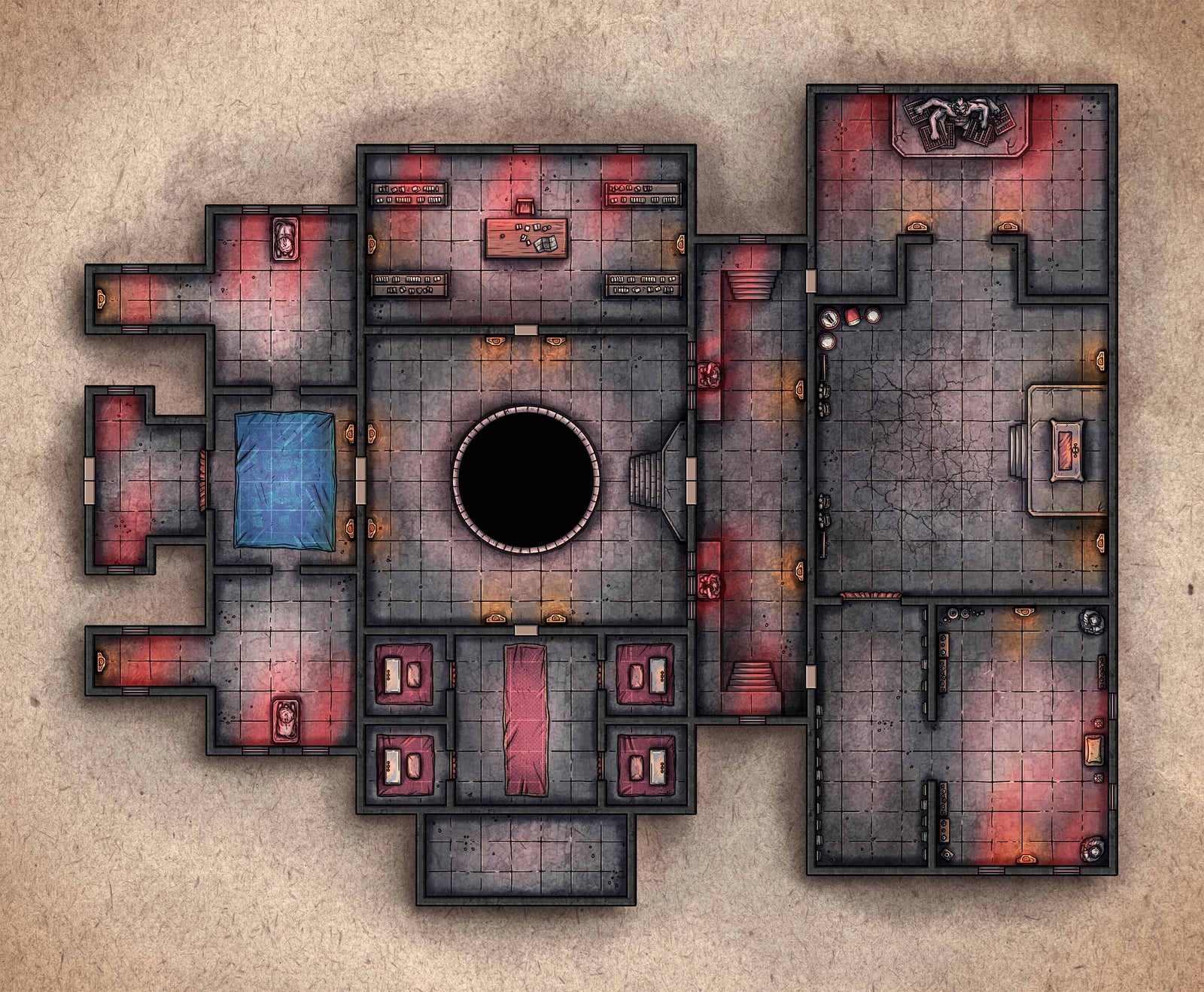
If you've ever stared at a blank sheet of grid paper and been totally lost about what to do next, this article is for you! I'm going to show you how I got this:

Out of this:

A note before we proceed: Not all adventures need maps, but most adventures have some element of site-based exploration. Even if you write for purely theater-of-the-mind play, you can still benefit from a strong visualization of the locations in your adventure.
One of my hangups with maps is the chicken-before-the-egg problem. Do you try to write the adventure first and then draw the map to fit it? Or do you draw a map cold before knowing much about the adventure?
If you had to choose one or the other, I think it's easier to write an adventure to an already existing map.
But! This has its limitations:
- The map might not merge well with your overall adventure idea.
- The boss room might wind up too close to the scything blades trap room.
- That random hallway to those four empty rooms suddenly doesn't make sense and forces you to add material that throws off the pacing.
For a control freak like me, that never goes well.
The fact is, maps and adventures designed in isolation from each other are often not harmonious. At some point you'll need to mesh the map and encounters together, and the longer into the process you wait, the harder it can become.
So I draw the maps and write the adventure together right from the start, building upon both in very small stages.
For the map at the top of this article, I started with a kernel of an adventure idea: The characters need to steal a black lotus flower growing inside a monastery guarded by demonic monk-sorcerers.
As excited as I was to start writing that very Conan-esque adventure, I first needed to make a list of what spaces might exist inside the monastery.
Room ideas: guard room, training hall, sorcery chambers, library, the black lotus room, central courtyard, meditation chambers, religious shrines.
Once I had a list of general locations, I made a second list of visual and thematic elements to really get my brain firing. If the rooms list is the bread, the thematic list is the delicious peanut butter plus Nutella.
Random roll tables (what up, Tome of Adventure Design!) and Google Images helped provide tons of inspiration.
Thematic ideas: shadows, red light, room of false doors, illusions, statues, blood moon, smoke, invisible paths, trials of worthiness, mirrors, hidden locations, poisoned water, beams of moonlight, fire, black-horned demons.
Note, it's always better to over-shoot on these lists and come up with as many ideas as you can. Then you can pare down and keep the very best ones.
Creating these lists and combining them helped me come up with encounter and pacing ideas:
- A shadowy guard room means combat with smoke-stepping sorcerers!
- The blood moon is rising over the courtyard, with a pit leading to the black lotus trials...
- A library would be a great place for an NPC encounter with a black-horned demon.
- A secret door could be behind a scroll rack in the library!
- A shrine would be a cool place for treasure, maybe with a trapped statue.
- The training hall could be an epic battle with sorcerer-monks...
Everything was starting to work together. I now had my overall adventure idea plus thematic rooms and encounters to bring it to life.
I was finally ready to start drawing that dungeon map!
...By doodling some circles and lines.
That's right! Drawing maps straight onto the graph paper has always eluded me. They never look quite right, and the spacing gets wacky. The squares of the graph paper also subconsciously move me toward blockier room designs.
So I always draw circles and lines in a notebook first to represent rooms and their connections to other rooms. That helps me visualize the flow of movement without over-committing to anything. I'm easily able to re-draw the lines and circles to make sure it all fits together.
You can see some of the circles and lines I made for the monastery map in the picture up above. You might notice how those circles and lines translated into the map, which was slightly different!
Once I was happy with the final version of circles and lines, I labeled each circle with its room contents. Guardians, library, training hall — all things that came from my original brainstorming lists.
With the circles and lines to guide me, I started sketching blobs and shapes in my notebook as a rough draft for each room. I refined each one until I was happy with the general shapes and features (water, pillars, stairs, statues, etc.), starting over quickly each time I wanted to get a full look at things.
No counting squares yet, no fussing with exact details. It was all very quick and loose, just building general size, spatial relationships, and the placement of key features.
Here's a second or third iteration of one of my blob drafts:

The final map came together as I wrote each section of the adventure with the blob map as my guide.
That was when I counted exact squares and drew them onto graph paper, committing to room size and the placement of all important features.
If you look closely at the below image, you'll still see plenty of eraser marks and scribbled notes. It all takes a bit of tinkering, right down to the final draft.

(I drew the courtyard stairs going in the wrong direction, oops!)
And so it was drawn! I traced over the lines in black ink and sent an image of the map (along with a list of notes) to a professional cartographer, who made it look ten times cooler than I could have imagined.
Let me leave you with a general list of useful things to keep in mind for making interesting maps:
- Have some circular room connections for the characters to choose various paths through the adventure.
- Make sure there are fun things in each room for characters to interact with as they explore.
- Avoid tons of empty, 30 x 30 foot rooms. It happens more than you'd think.
- Long, meandering hallways can be fun, but they're also easy to overdo.
- Perfect realism is not necessary — this is a fantasy game! You don't need a full kitchen, the privies, and every walk-in closet unless there's a good reason.
- Changes in elevation are great to include.
- If a combat is likely to take place in a room, do a mental test run to make sure the room works well for the kind of fight you're designing. How far would the PCs move in on their first turn? Whom would they attack first? What terrain and hazards exist? Would a fireball instantly decimate all the enemies?
Maps are always going to be a tricky and ever-improving art form for me, but believe me — if I can somehow do it, you can too.
Build piece-by-piece alongside your writing, make idea lists to pull from, and draft and trash plenty of simple sketches until you're ready to commit.
P.S. The monastery map from the beginning of this article appears in Monastery of the Shadow Sorcerers, an 8th-level adventure that's part of Legends of the Library, Vol. 1. You can scope it out here if you want to see more!
Also in Arcane Articles

How To Design Exciting D&D Encounters
November 08, 2022 6 min read
Encounters are one of the most important parts of Dungeons & Dragons. So how do we make sure we're designing good ones?
Read More
How to Write A D&D Adventure: The Complete Guide
October 21, 2021 14 min read 6 Comments
So you want to write a 5E D&D adventure? Read on for the step-by-step process I've developed over the years for writing an action-packed D&D adventure with as little friction as possible.
Read More
Imagine First, Design Second
May 05, 2021 4 min read 7 Comments
Sometimes, I write a dud. Here's the story of how I recently wrote an adventure that went nowhere, and how I managed to learn something useful from the whole experience in the end.
Read More